In large part due to evolving technology and increased use of mobile devices web design trends come and go. From web designs, navigation and programming to content and imagery, everything has evolved. Just for fun, take a peek at the Way Back Machine and type in the URL of a site to take a look back…way back… and notice how trends have changed over time. Old designs used to feature Flash graphics and overdone effects that made a site unresponsive. Today, a website has to not only look just as good (or better) on an Android as it does on an iPad or desktop computer but also be responsive. So, what can we expect this year? Based on trends that gained traction over the past year such as that responsive web design, speed and a stellar user experience, there is more than likely to be a continuation of these concepts. Below, our web design team has taken a look at some of the trends we can expect to see more of in 2016.
Top 6 Web Design Trends Taking Shape in 2016
1. Hamburger Icon Navigation
As more and more people use mobile devices they will start becoming more accustomed to seeing and using the “hamburger menu icon” as the way to initiate navigation. New to the hamburger icon? You’ll usually find these three horizontal lines in the upper left hand corner of your mobile website that indicate navigation. This should naturally carry over to desktop over time. Besides, by not having all of your menu items displayed at once, this can allow the user to focus more on your business’ positioning statement (usually placed in the header hero area) and create higher conversions for your call to action. We predict that you will see more and more of the hamburger icon replacing full navigation bars this year.
2. Long Scrolling
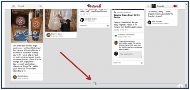
Some sites are minimizing scrolling to get to the point quickly. But we believe scrolling is still the way to go. Not only are your customers are accustomed to scrolling – even on mobile – but also longer scrolling helps to increase engagements by providing a storytelling opportunity and including more call to action buttons.. People will not think twice to scroll down the page to see more information.
3. Flat Designs
Flat designs are a minimalistic design approach that focuses on usability. The two-dimensional flat trend will keep on going strong and it is showing no signs of stopping. A flat design is great since it gets the message across much faster as there is less of a distraction (such as gradients, bevels, drop shadows.) The clean, crisp edges with flat illustrations improve readability and that is very important when it comes to designing. Flat is also huge for the web to reduce load times on sites. Right now there is a lot of focus on getting your website to load faster and faster, especially since Google is starting to take load times into consideration for organic ranking.
4. Custom Photography
Using custom photography for your company website has so much more depth and substance than most of the stock photos that exist on the web today. It gives your brand so much more personality and makes you unique. With the advent of more accessible, easy-to-use HD cameras, custom photography is cheaper and easier than ever to come by and incorporate in your website.
5. Focus on Forms
Name. Email. Message. Send. It’s simple and it’s fast. Web forms allow potential customers to contact you quickly and easily without having to copy and paste your email, open up their email browser, paste it in there and then create a message. The less steps you have to make them go through, the better chances they’ll become a customer. Opt for a full-width form which allow for the user to focus on one thing only…and that’s filling out the form in front of them. It takes away all of the other distractions in the background and will also help to boost conversion rates.
6. Animations
Animations can bring a stagnant website to life and make it more interesting…it can also ruin it. If your website is still living in the FLASH technology age, all those animated effects could be slowing your website down greatly. Keep animation effects short, yet exciting, to help with load-time concerns. Attract the user’s attention to important details but there’s no need to go too crazy.
Website Functionality
There are certainly more trends that we didn’t address, these are just a few of the big ones you can expect to see more of throughout the next year. Web design trends continue to evolve and it’s best to analyze which ones are right for your online presence. Visit a fully animated, funky site that doesn’t load quickly and a user will leave immediately. Consumers want and need a fully functioning, responsive site first, with a nice design second. CMDS’ web design team has been there and back again. We know what works and what doesn’t. Are you considering a website redesign? Talk with our web design team today and put our creativity to work; give us a call at 732-706-5555.


