The Ultimate Guide to Web Design for Healthcare Brands
Chris Mulvaney is the CEO of CMDS. I make things... I’m the creative entrepreneur with passion for (re)making brands and inventing solutions to problems no one knows exist.
Let’s set the record straight: Web design for healthcare is different than any other industry. If you’re designing a website for a healthcare brand, you should never rely on generic templates or out-of-the-box website themes.
The reason? Hospital systems, medical practices, insurance companies, and other healthcare brands need their websites to serve many different functions. Healthcare websites need to be informative and educational, helping visitors learn about their conditions and find the right medical providers to get treatment. They also need the functionality to allow visitors to retrieve medical records and pay their bills, without breaking any HIPAA regulations. All of this needs to come nicely packaged, with a user experience (UX) that meets the needs of visitors of all different ages and demographics.
In short, web design for healthcare brands comes with some unique challenges.
Healthcare brands need their websites to reflect the image of their organizations in order to attract high-value patients. Personalized content is the cornerstone of great SEO, but finer details, like website anatomy, colors, design aesthetic, and layout play a role in overall performance, as well.
The latest trends in web design for healthcare brands place a strong emphasis on seamless digital experiences, moving website visitors from one section to the next with consistent, easy-to-understand web interfaces.
Unfortunately, medical websites that have been upgraded to take into account the latest trends in web design for healthcare are the exception, not the norm. The healthcare industry has fallen behind other industries in digital marketing, and surveys show that healthcare marketers tend to be over-confident in the effectiveness of their existing websites.
According to one survey, 61% of healthcare marketers conduct usability testing on their websites and 57% conduct web visitor satisfaction research. More than half (57%) say they are planning to make design changes to their websites in the coming year.
What kind of changes should they make, and which design considerations have the most impact on web visitors? Let’s take a closer look at some of the latest trends in web design for healthcare brands.
Setting Goals

One of the first questions we ask our healthcare clients here at CMDS is to tell us about their digital marketing goals. The answers we hear run the gamut from freshening up a stale brand image to providing a new feature for patients, like online bill pay and patient portal access. Some healthcare organizations are using web design to build their online presence or improve their reputations within the industry.
As you put together a list of your own goals, consider your answers to these questions:
- Do you need to optimize the experience for visitors on mobile devices?
- Are you interested in being found by more prospects?
- Are you interested in converting more prospects into leads?
- Does your existing website have mechanisms for converting leads into patients?
- Are you hoping a redesigned website will increase patient satisfaction rates?
- Is this website redesign project part of a larger rebranding effort?
The answers to those questions will inform our decisions as far as how to proceed forward with your website design project. Web design for healthcare is a unique beast, and these types of projects require a significant investment of time, money, and effort. We want to have a clear understanding of what our clients are hoping to achieve in their projects so that we can help them reach those goals.
What Patients Want in Healthcare Websites
Instead of guessing what visitors want to see in healthcare websites, we recommend that organizations survey their patients and ask which features their existing websites are missing.
Based on our conversations with healthcare marketers and patients, we have come up with a list of common issues that patients have with healthcare websites. These include:
- Too difficult to find the right medical provider
- Navigation menus don’t work on mobile devices
- Unable to access medical records, such as lab results
- Unable to pay bills online
- Website pages take too long to load
To be clear, plenty of healthcare websites take into account these concerns. The issue is how newer healthcare websites are designed. Web design for healthcare requires a strong understanding of the best practices in user experience and layout, which is one of the reasons why most healthcare brands opt to work with digital agencies that have experience with organizations in their same industry.
Challenges in Web Design for Healthcare Brands

The way patients interact with healthcare websites has changed significantly in the past decade. Not only are patients more likely to be visiting websites on their smartphones and tablets, but they are also more likely to expect certain service-oriented features, like the ability to access lab results or pay their bills online.
The primary reasons why people visit a healthcare brand website are to find services, to search for providers, and to find directions to clinic locations. Unfortunately, many of the websites designed for large hospital systems are created in a way that makes them difficult to access for users on mobile devices. That means these websites aren’t meeting the needs of patients, and rebuilding these websites needs to be a top priority.
Some healthcare marketers delay making updates to their website design out of concern over HIPAA compliance. HIPAA regulations govern the way healthcare organizations can collect and share patient information online, including records and appointments, along with the storage of information and general website security. During a website redesign, healthcare marketers need to make sure SSL encryption has been activated across their sites, not just on certain pages. This can create problems down the road, if certain pages or articles are moved around and the SSL protections are disrupted.
As always, the devil is in the details here. Achieving full HIPAA compliance is possible, but the process is much easier when you work with an agency that has experience designing websites for healthcare clients.
Latest Trends in Web Design for Healthcare

Now that we’ve covered the most common issues that patients have with healthcare websites, and the challenges that organizations have in addressing those complaints, let’s dig into the fun stuff.
Web design for healthcare is serious, but it doesn’t have to be boring. Keep these considerations in mind as part of any web design project.
Responsive Design
Responsive web design is a term you’ve probably heard before. The approach has become standard for all modern websites, thanks in large part to the growing number of visitors on mobile devices.
A responsive website is one that resizes itself depending on the type of device a visitor is using. For example, the website might look different on a desktop computer than it does on an iPhone screen.
Responsive design is important for healthcare brands for the same reason it’s important to everyone else: Responsive websites increase visibility on search engines, which leads to more traffic. The greater the number of visitors, the greater the conversions for the healthcare brand.
Clean Aesthetic
A healthcare brand isn’t an art house. People expect healthcare organizations to uphold a certain level of professionalism, and that comes through in their website design.
The design of a healthcare website should enhance the brand, not distract from it.
When it comes to web design for healthcare brands, we recommend that our clients move toward a clean, modern aesthetic. This look is pleasing to the eye, and when it’s done right, it can really humanize a large healthcare brand.
Straightforward Navigation
We’ve touched on navigation previously in this article, but the topic is important enough to revisit. Visitors coming to a healthcare brand’s website shouldn’t have to dig through mountains of content to find the information they are looking for. Some of these visitors might be in pain, or they might be elderly and not computer savvy.
The best healthcare websites meet the needs of all their visitors, regardless of age or demographic. How do they do this? By creating website navigation bars and calls-to-action that are clear and easy-to-understand.
For example, a hospital system or medical group should always have clear links with titles like “Location,” “Meet our Physicians,” and “Insurance Information” with prominent placement on the homepage. Additional navigation features that patients appreciate include buttons that encourage visitors to “Schedule an Appointment” and “Call the Office,” with a link to the office or hospital system’s main phone number.
Optimized for Search
Healthcare websites should be designed in a way that meets the needs of existing patients, but that’s not the only group to be concerned about. We recommend designing websites in a way that ensures they are optimized for search, which makes it easier for both new and existing patients to find your website on Google or Bing.
Try using an analytics service, like Google Analytics, to get a sense of which keywords visitors are using to find your website. If you run a surgery center in Maine that specializes in cosmetic surgery, then your website content should include plenty of related keywords, like “Maine cosmetic surgery.”
Designing your website to include an integrated blog is one way to improve your SEO, ideally bringing you more visitors who will engage with your content and ultimately convert to new patients.
Examples of Great Healthcare Web Design
The best healthcare websites share some common features, like responsive design, clean aesthetics, and straightforward navigation. But it’s always nice to see some real world examples.

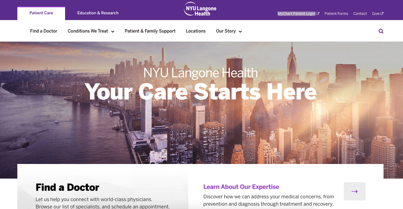
The NYU Langone Medical Center website has a number of things going for it, starting with a calming, high resolution image of the sunset in New York City. Visitors can use the “Find a Doctor” tool to search for physicians by specialty, condition, treatment, or name. This is an important feature from a patient’s perspective, because it allows visitors to search for physicians who can treat their conditions even without knowing which department or specialty they should be searching for.
Another important web design trick utilized on the NYU Langone Medical Center website is the decision to place “MyChart Patient Login,” “Patient Form,” and “Contact” buttons along the top of the home page, speeding up access and improving navigation for visitors who no longer have to scroll down the homepage to find what they are looking for.

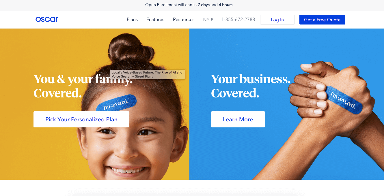
Oscar considers itself a “new kind of health insurance company,” and its website sticks close to the established best practices in web design for healthcare brands. Oscar uses graphic colors, images, and text to bolster its navigation system, funneling visitors into one of two paths—consumer or business—right from the start. The website’s header also features a countdown showing how many days and hours are left during the open enrollment period ends. Visitors will appreciate the large “Get a Free Quote” button, which is positioned prominently at the top of the website, as well.
University of Illinois Hospital

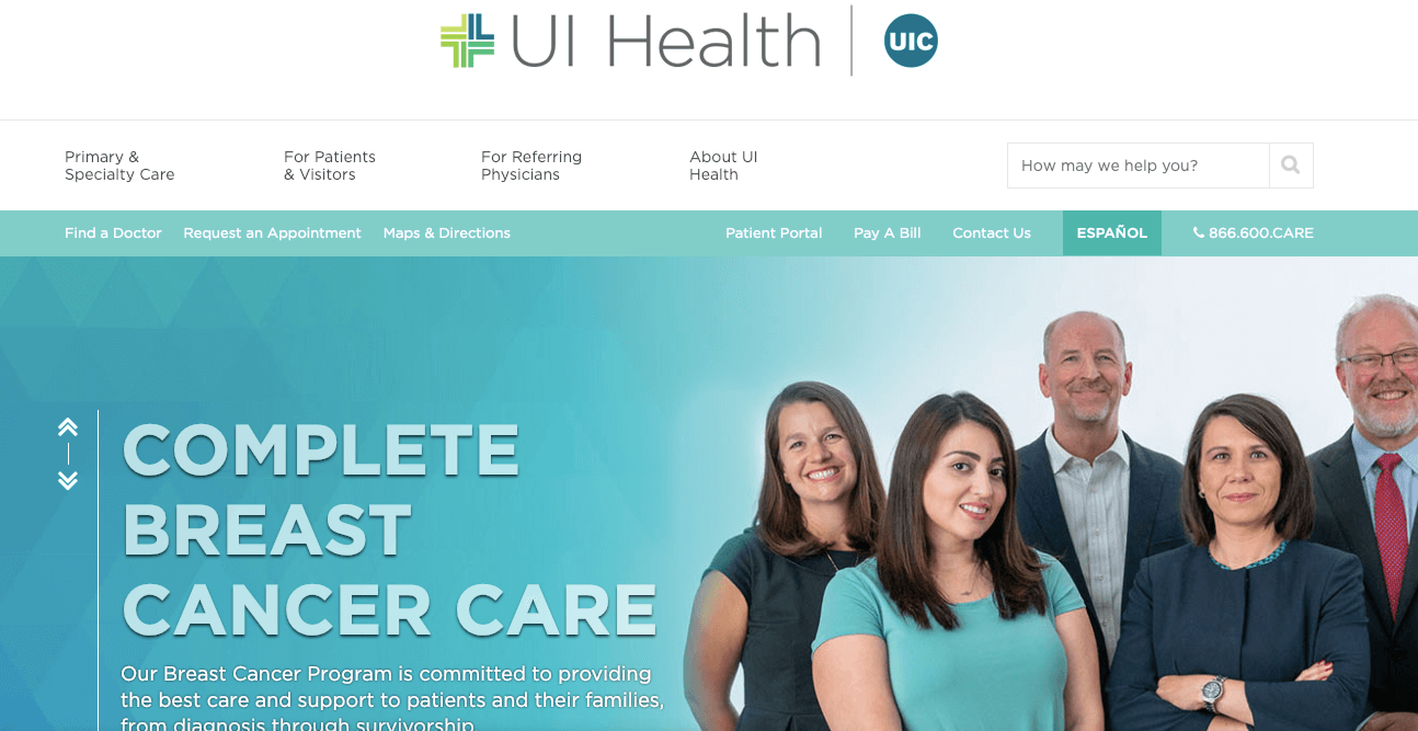
The University of Illinois Hospital redesigned its website to put a greater focus on patients. The new website has a fresh, clean look, with cool tones and a crisp font that is easy to read. One of the most interesting features on the University of Illinois Hospital’s website is its “Find a Doctor” directory, which visitors can use to find physicians who treat their ailments. The website also includes an “Appointment Request” action, which visitors can click on to request appointments directly through the website.
What do the best healthcare websites have in common? For starters, they all reflect the organizations they represent. Oscar’s website is bright and youthful, just like the company. The websites for NYU Langone Medical Center and the University of Illinois Hospital both feature clean, modern design with large fonts and a number of patient-focused features, like “Find a Doctor” directories and patient portal links.
Web design for healthcare brands is about more than just plopping a logo on a template website. A lot more. At CMDS, we understand how important it is for healthcare websites to reflect the organizations they represent. That’s why we take the time to get to know our clients, and understand their priorities and values, before we embark on any web design projects.
If you’d like to collaborate on a project to modernize your healthcare website, then give us a call at 732.706.5555.


