10 Elements of the Best Landing Pages
Chris Mulvaney is the CEO of CMDS. I make things... I’m the creative entrepreneur with passion for (re)making brands and inventing solutions to problems no one knows exist.
When crafting a landing page for a new campaign, our web designers follow a set of best practices. Over the years, we’ve built, tested and reviewed hundreds of landing pages, and in that time, we’ve refined our process to be as effective as possible. Want to know what makes them so great? Here are ten common elements of the best landing pages, proven to call attention and drive conversions.
What is a Landing Page? What is its Purpose?
 A landing page is a hyper-focused web page designed to attract sudden interest and direct visitors to a single call-to-action using concise information and a short online form. Different from your website that has multiple pages built to encourage web visitors to navigate around and click through your website, a stand-alone landing page focuses on one enticing subject matter and has one main goal. The goal is to acquire leads by “controlling the flow” of how users interact, navigating them where you want them to click in order to convert.
Landing pages can be extremely effective when used to inform users about a new service or product release, educate a specific group of people about a conference, webinar or event, promote a one-time discount or promotion and so much more.
Learn the must-have elements of the best landing pages to master this important first impression.
10 Must-Have Elements of the Best Landing Pages
 Remember, every industry and audience is unique. These elements are not meant to be an exact formula, but rather to use as creative guidelines for your own landing page design.
1. Design
Landing pages give you the unique opportunity to establish a great first impression with prospects and turn those prospects into customers. Lifelong customers. But that is only possible with the right framework.
One golden rule when it comes to website design for landing pages is to keep the main message “above the fold.” Originally referencing the top half of a newspaper (that section you read when the paper is folded in half), “above the fold” is where you want to place important information and your call to action. Require users to search around or scroll down to find the CTA… and you’ll see click-through-rates drop.
And, remember to be mobile friendly. Especially in today’s digital age. The best landing pages have a responsive design that looks great and works great on all different devices like smartphones, tablets and laptops.
2. Page Headline
Once someone arrives to your landing page, they’ll need to be convinced to stay. One of the most important elements of the best landing pages is the headline. An effective message for your landing page headline must be clear and concise while attracting the audience’s attention and enticing interest.
When you have the right landing page copy, your call to action will be irresistible to your audience. Without it, they’re likely to leave without converting.
With only a few words to execute such a grand task, it’s also one of the most difficult elements to craft. Because of this, persuasive subheading copy is also key to drive the message home.
3. Imagery
 Images are essential to quickly convey a message to your audience. In fact, images are said to help people process information up to 60,000 times faster than text alone. The “hero shot,” that eye-catching image featured on your landing page, should clearly represent the message and feelings you’re trying to convey. To be effective, it must be relevant and match the keyword of your landing page.
Consider using an authentic photograph of an employee or a customer instead of a stock photo to help your audience make a stronger visual connection. Male vs female? Demographics will depend on what resonates with your specific target audience best. Don’t be afraid to use A/B testing for different images.
4. Identifying with the Audience
You can be sure they’re going to ask, “What’s in it for me?” Your audience has a problem. You have the solution.
The best landing pages help their audience recognize the problems they’re searching to resolve and they also clearly explain how your product or service is the solution. Without diving into too many details, outline the best features of your product or service and tie each one in to the solutions they will provide the audience. Through real-world context and imagery, make the message easy to scan through and absorb.
Your audience doesn’t just want to see your product, they want to see how a customer has used your product to overcome an obstacle like theirs. Build that connection.
5. Social Proof
The power of social proof is undeniable; it could be the key to optimizing your next landing page. Testimonials are a powerful way to demonstrate trust, authority and make a strong connection. According to a report from Nielsen, 70% of people will trust a review from someone they’ve never even met.
 But, whose testimonials should you highlight? Generally speaking, recommendations from CEOs and Founders tend to hold more weight than any other customer, as they’re better-known than the average consumer. Either way, the testimonial should reveal a positive connection with your brand. Include a detailed quote and whenever possible, make social proof even more effective by featuring the customer’s photo, name and title. The headshot is important because studies show that looking at a human face increases a visitor’s level of trust in the claims being made. It also solidifies that sought-after human connection.
Testimonials that relay the message, “don’t just take our word for it,” aren’t the only way to demonstrate credibility and trust. Social mentions, reviews from other sites and client logos are also very effective at proving why your brand is qualified to solve their problems.
6. Value Proposition
With so many competitors offering the same product or service you are, why should potential buyers choose your brand over everyone else’s? And how will their lives be better by taking the time to fill in that website contact form?
As one of the most important elements that determine whether they’re going to bother filling out the form or hit the back button, it should be the first thing people recognize when they arrive on a landing page. Basically, you have less than 8 seconds to clearly explain how your brand is going to solve their problem (relevancy), deliver benefits (value) and why they should choose you (differentiation).
At its heart, a value proposition is your brand’s promise to consumers that you are going to provide something they need. Now. By the way, if you can’t put your finger on anything unique that stands out about your brand, it’s time to create something.
7. A/B Testing
 As we mentioned at the beginning, there isn’t an exact formula behind the best landing pages. Based on your industry, audience and message, the elements of a landing page will differ. That’s why A/B testing is critical. Things like slight changes to copy, colors, images, layout and even simply the size of your button can drastically change conversion rates.
Test and retest to monitor what makes your page most effective with your audience.
8. Must-Click Call-To-Action
Landing pages are designed to get someone to take action. The most effective way to do that is with one, simple call-to-action. The best landing pages don’t confuse audiences by scattering their eyes and minds in multiple directions, they’re designed around a clickable call-to-action that quickly guides them to take that exact next step. When your audience lands on your page, consider what “buyer stage” they’re in and then build your landing page around that.
Use short, action-oriented words that invoke reaction as well as directional cues such as arrows and pathways to direct the human eye. From the button color and copy to the layout and design, the best call to actions create a sense of urgency to act on your irresistible offer.
9. Link to a Larger Strategy
Whether you’re using your landing page to capture leads, register users for an even, download content or sign up for special offers, the success of your landing page has a lot to do with what gets them there in the first place. The best landing pages are paired with a strong marketing strategy, such as a PPC ad campaign and retargeting ads to nurture and convert leads through the entire buyer’s journey.
Additionally, using inbound links that direct users to your landing page will do wonders to boost SEO rankings. And remember to use your landing page target keyword as anchor text, Google loves that.
10. Measure Success
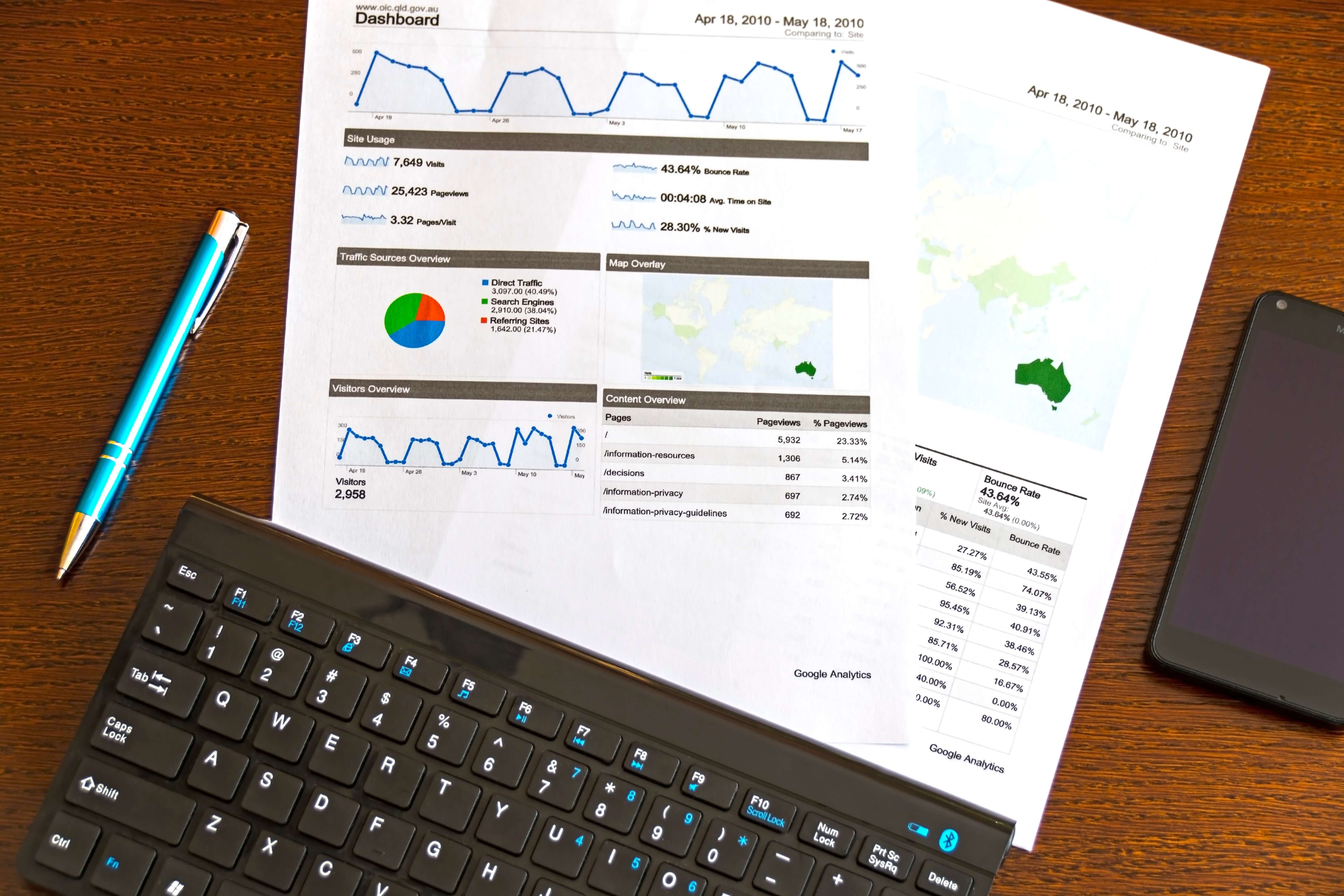
 We’ve spent a lot of time exploring techniques and elements of the best landing pages, but how do you measure your success? At CMDS, we look at conversion rates, landing page bounce rate, time spent on the page and much more. We take the time to connect the dots and dig deep into the data to get an accurate and clear understanding of your page’s performance.
Does all of this sound a little overwhelming? No worries. We gotcha!
See how landing pages can turn more of your visitors into customers. Let’s talk.


